
The Colours That Calm Your Brain (And How to Actually Use Them)
You’ve probably heard that certain colours can “calm you down”—soft blues, sage greens, warm neutrals—but it can be hard to tell whether that’s actually real or just another aesthetic trend that looks nice online.
Because if you’re anything like me, you don’t just want your space to look calm, you want it to feel calm in a way that actually makes a difference.
The truth is, your brain responds to colour faster than you even realize, and before you’ve had a chance to consciously think about what you’re seeing, your nervous system is already reacting to the tone, brightness, and contrast around you.
Some environments naturally feel softer and more grounding, while others feel sharp or overstimulating, even if you can’t immediately explain why.
So while colour isn’t a solution for anxiety, it can quietly influence whether your space feels heavier or lighter.
In general, softer and more muted tones tend to create a calmer response.
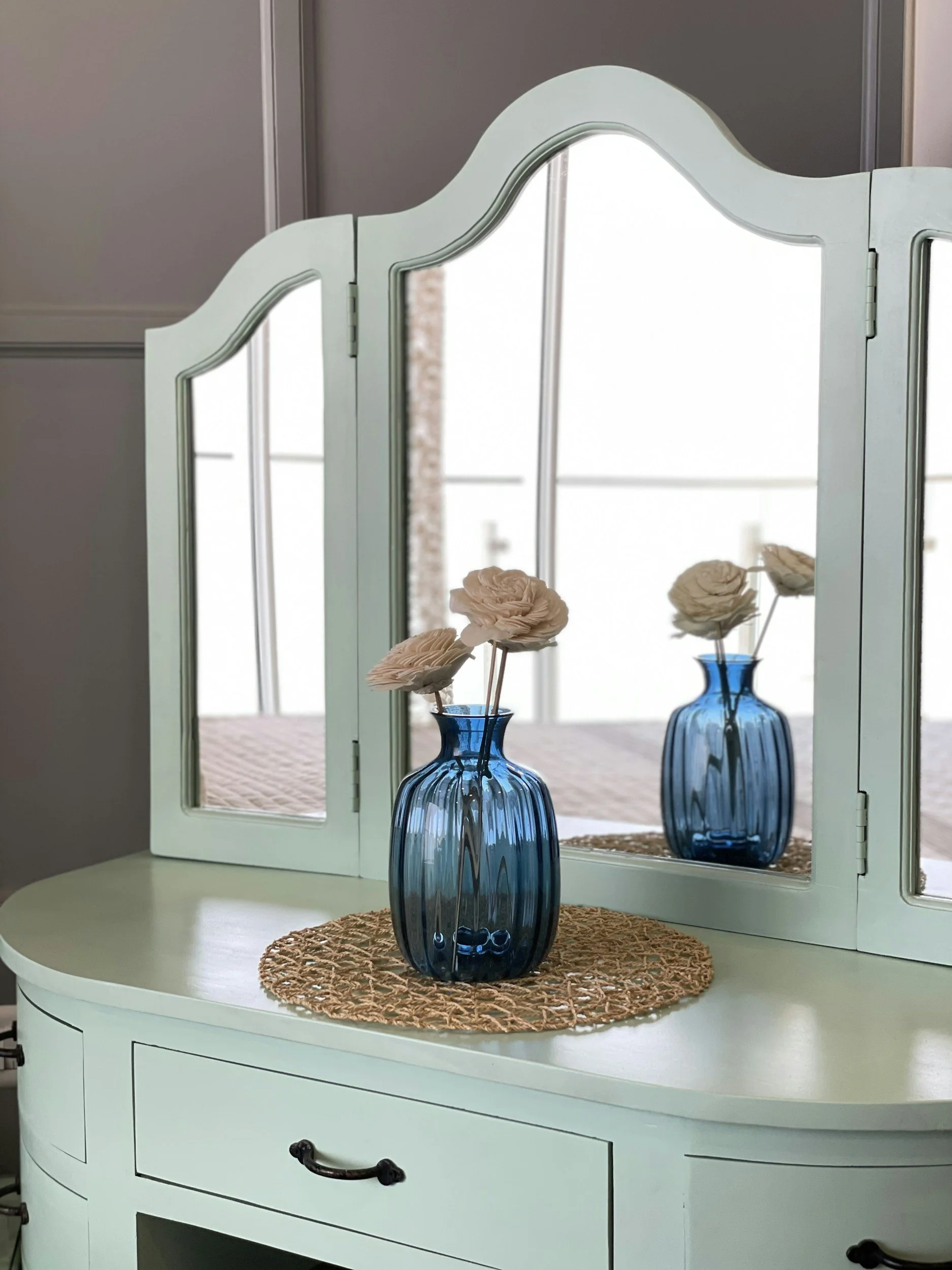
Blues are often associated with open, expansive environments like the sky or water.
While greens - especially earthy or muted tones - can feel grounding.

Warm neutrals like beige, cream, and soft browns tend to be the easiest on your eyes.
These colours don’t demand your attention, which gives your mind a place to rest.
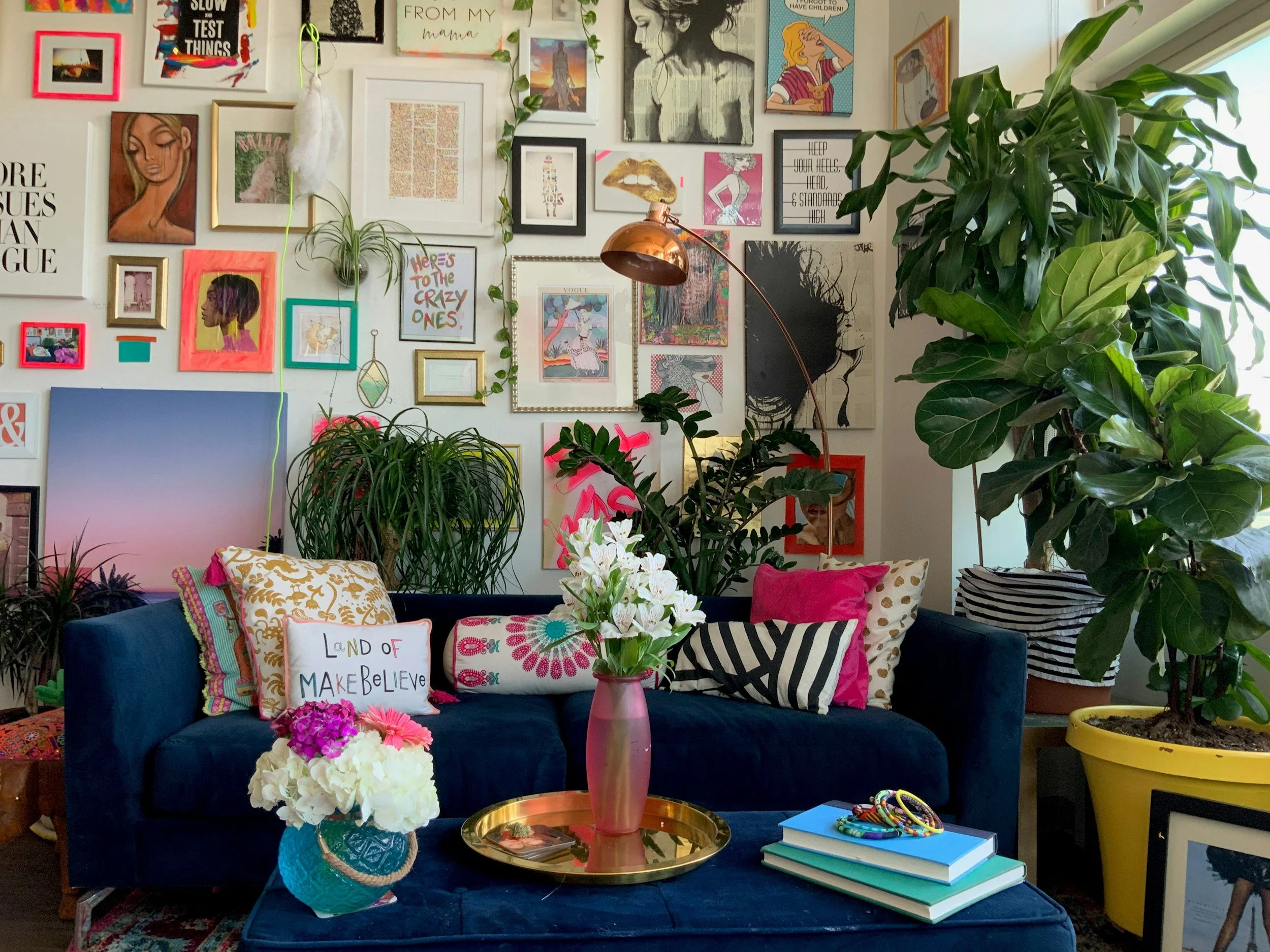
Brighter or high-contrast colours can feel more stimulating.
This isn’t necessarily a bad thing (this living space is gorgeous!) but it can add to the noise if your brain is already overwhelmed.
That being said, this isn’t about changing everything or creating a perfectly curated space.
You don’t need to repaint your room or buy all new things just to feel calmer.
What actually makes the biggest difference is much smaller than that.
Start with what’s already part of your daily life, like the colours you wear, the background on your phone, or the kind of lighting you use in the evening.
Sometimes a space feels overwhelming not because there’s too much in it, but because it feels visually loud, and even a few softer tones can take the edge off in a way that feels subtle but noticeable.
A few simple shifts can go a long way, like choosing a neutral-toned blanket, switching to a calmer phone wallpaper, using warmer lighting at night, or wearing something that feels visually quiet on days when your mind already feels busy.
Nothing dramatic or expensive—just small adjustments that make your environment feel a little easier to exist in.
At the end of the day, it’s not really about the colour itself, but about how your environment makes your nervous system feel, and how much space it gives your mind to slow down.